
Moving through prose
Exploring better ways to display linear longform text
-
 2 mei 2016
EN
2 mei 2016
EN
As a self-proclaimed ‘hybrid’ novelist, I worry a lot about how to present my writing to my readers. What can I do to give my work maximum impact?
In the world of paper books, this is a solved problem: an entire industry was built around the optimization of printed text, making novels and non-fiction books alike as well-written, beautiful and useful as they can be. Within the confines of the medium, of course, with a practical amount of specialized editors, designers, typesetters and printers.
In the digital field, this is not so much the case; text can be presented in many ways, and the reader and the writer can be in constant communication. Parts of this possibility space haven’t been explored, or only lightly. Not even trying to be hyperbolic, anything can happen on the screen… It’s really a matter of figuring out what to show and how to show it.
I get very excited thinking about these problems, which is just what I’ve been doing since around 2013, when I turned my debut novel Toiletten (Bathrooms) into an experimental iPad app. And right now, together with a talented group of collaborators, I’m working on a completely new novella, Geometry Girl, that improves on the original experiment, while adding some additional elements.
Along the way, I came across many other interesting examples and ideas, that I want to share here along with some of my own considerations and solutions. In this post, I will focus on the basics of how to present text on-screen: the core reading mechanism. With a focus on the touchscreen devices that I deem most important, and the form that I work in myself: the literary novel.
Scrolling
So how do we currently deal with text? The most common and popular mechanism, by far, is scrolling. There are huge benefits to this approach. It’s so direct: you grab the page with your fingertip and throw it around, just like that, making it a great fit for the touch technology.
However, there’s a cost: the constant coordination between the text, your finger and your eyes, as you figure out where you are in the text and decide how fast you’ll move, causes a cognitive load of the kind that seems unnecessary.
In fact, scrolling makes it so easy to move quickly that you’re encouraged to skip ahead. This is why it works best when you’re scanning content quickly, for example to look something up. But it’s not so great when you want to read longform text like a novel carefully, really burying yourself in it and making the text come alive; what academics call ‘deep reading’. This kind of reading is my prime concern; I want you to take the time to really absorb what will hopefully be beautiful and interesting.
There are some alternative input methods for scrolling, like the good old scroll-wheel and reading app Instapaper’s tilt-scrolling1, which lets you pitch your device to further the text. Ultimately, it’s all still scrolling, and similar trade-offs apply.
Page-flipping
A true alternative to scrolling, and quite popular in reading apps, is the page-flipping mechanism. It totally clings to the old world, deliberately emulating the experience of reading analog book on the digital screen.
Whether they actually show you the page turning, as in Apple’s iBooks, or just move you from page to page sideways, as in Amazon’s Kindle app, the intention is not just to make you feel at home, but also to replicate a more quiet, in-depth, focused kind of reading on an intrinsically chaotic, dynamic device.
Page-flipping succeeds at this: it is nice to have text fixed in place on seemingly static pages. Reading novels is better this way than it would be by scrolling (which you can often try by switching to just such a mode).
But there are downsides too: as you flip back and forth or change the font size, pages are dynamically processed, making sentences and paragraphs move around sometimes. The illusion of reliable spatiality is broken.
Additionally, flipping through more than one page quickly becomes tedious, as you can’t skim like you could on paper. Attempts to improve page-flipping with multitouch like in this Korean video from 20122 haven’t gone anywhere.
Finally, an age-old problem from paper books resurfaces: sentences (and sometimes words) are cut off at the bottom of a page, so you have to keep half a thought in your head while flipping pages. We’re used to this, obviously, but it’s another cognitive load that doesn’t need to be there. (I’d say it was originally an economic trade-off to save paper.)
The paper book metaphor was a necessity on specialized e-reader devices, as their e-ink screens couldn’t update all the time. But looking at the statistics the e-reader is in a slow decline worldwide, while color touchscreen reading, especially on the phone, is on the rise.3 We should be able to quickly move on to something better.
Atomic content units
So how could scrolling and page-flipping be improved upon? As alluded to, I think it’s all about what to show on screen, and how to do this, which are interrelated questions. One of the ways to go about this is breaking a longform text into smaller pieces, ‘atomic content units’ if you will, and reassembling these on the screen in a sensible way.
The app Spritz breaks texts into the smallest possible atomic content unit, the word.4 Flashing words in rapid sequence, the promise is that you’ll be able to improve your reading speed.5 This seems to work quite well: Spritz easily makes you read faster than you thought possible, and potentially from much smaller devices like smartwatches.
But for literary content, this seems to be a dead end. You want readers to be able to ponder the text for a bit, go back to read a sentence again, and be comfortable while reading. Novels are not for people in a hurry.
Sliced into paragraphs
The creator of OS X app Slicereader had an interesting thought: why not break text into individual paragraphs and show these one by one? You can throw any and all texts at it, of which it shows one ‘block’ at a time. You then hit the space bar to progress to the next part.6 I was already making Toiletten when I found this app, and it of course rang a bell.
Testing Slicereader, its value seems obvious. But as a general-purpose app it hasn’t taken off. It’s not in active development and was last updated in 2013. Perhaps in standalone form, where you actively have to feed it prose, it just doesn’t make reading that much better.
The card metaphor
Somewhat related to showing one paragraph at a time is the visual metaphor of the card. Much has already been said about this ‘design pattern’, but I first became aware of it in the now-defunct Circa news app. This app condensed news into cards that gave a quick overview of a story, and allowed you to dig deeper by reading other cards.
The card really isn’t an atomic unit of text. It’s a specific collection of elements with a substantial hierarchic range: primary and secondary text, an image, tags. It may be an atomic unit of ‘news’, or perhaps ‘story’, though, and there may be some applications for linear longform text.7
What if we use it to distill a text into shorter, more concrete bits? Would that diminish its benefits? Would that make it more accessible? And if both of these are true, which is more important?
Either way, I doubt that we need a visual metaphor like the card for that so very complex, yet simple form of literary text.
The Conversation
Now consider the ‘conversational’ interface: atomic content units presented as message bubbles, triggered by simple choices or even real language input. The Quartz news app works this way, and my friends at Hubbub tinkered with it too8. With bot support in Facebook Messenger, conversational interfaces promise to be everywhere soon.
Closer to literature, the conversational interface is related to interactive fiction, in which you read a block of text, then make a choice that influences the next block. In the related text adventures form, you manually type a command.
In fact, early on in my research I took a lot away from interactive fiction apps like Frankenstein.9 Check the trailer to see how units of text slide in; that was the basis of my Toiletten app. Frankenstein was made by Inkle Studios, the group that went on to have a hit with 80 Days, and recently opened up its Ink Engine.10
Both the conversational interface and interactive fiction are relevant here, but not directly applicable to longform text on touchscreens. However, they do show some of the possibilities for dynamic text manipulation.
The screen as the unit
Finally, there’s a whole subcategory of digital storytelling formats that uses ‘the screen’ as its atomic unit. Fish by Robin Sloan11 was an early example, in which you tapped through a visual and verbal sequence. Josh Kalven goes deep on the screen format, even looking for a good name for the phenomenon, although he doesn’t talk about fiction applications.
The screen is similar, but different, from the card metaphor. Screens offer the same kind of information ‘chunking’ without the heavy-handed visual metaphor; Kalven talks about the natural storytelling ‘cadence’ of the format as well as its inherent suspense.
Sure, this is similar to any other linear form, including paper books, but there’s a subtle difference in the amount of authorial control. On paper, you are expected to read word by word, sentence by sentence, but you could always lose patience and look ahead (maybe even read the ending), before going back. It’s more loose, more analog. With the screen format, you don’t move to the next screen until you do.
The screen format was somewhat easier to author when iPhones all had 3,5 inch screens, such as when Sloan made Fish. With today’s many different screen sizes, including tablets, I feel like the format is steered more towards visual storytelling. Text becomes a secondary element within the context of a screen-filling image.
The New York Times’ Snow Fall happened around the same time as Fish, and made ‘enhanced longreads’ a thing. The two forms sometimes collide, especially when the ‘screen’ format is presented in a web browser and scrolling triggers the next screen. There are even hybrid forms such as this baseball longread, another New York Times production.12
My solutions
What excites me about this challenge is that text, as a sequence of characters, punctuation and spaces, is so simple, there should be ways to present it more naturally, fluidly, digital-natively. Through simple algorithms, and with unlimited virtual screen space, we should be able to automatically break up text better than we used to on paper.
My current prototype app shows as much text as possible on a screen, but is committed to wholeness. Ideally, sentences and paragraphs are kept intact, and they’re only broken when the screen is not large enough for a single paragraph or sentence. The app also tries to divide chapters, sections and paragraphs evenly across ‘blocks’ of text.
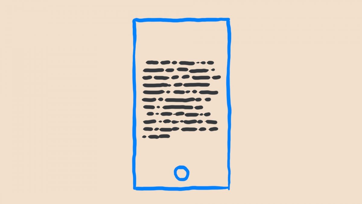
These blocks are presented one by one, beautifully typeset on an uncluttered screen13, at the tap of the bottom button. I must admit the single button at a single position doesn’t seem optimal yet. There may be a better solution: using the earpods’ clicker, tapping on the device itself, making clacking sounds or snapping your fingers, or even winking at the front-facing camera. Surely in the future you’ll be able to will your device to the next screen of text.
The grand trick, I feel, is that if you want to look something up, you can always scroll back.14 The surrounding text will instantly pop back into view. It’s a hybrid of sorts between the more measured, static page-flipping and the dynamism of scrolling, and already works quite well.15
There’s something to be said for not straying too far from simply scrolling, as it’s just so natural and convenient. Mike Bostock raises some cautions over this, especially in the light of all the ‘scrolljacked’ longreads. He argues that scrolling is effortless, while clicking is coordinated; I wonder if that is such an absolute difference. Both are not ‘instinctive’, both can be taught. And you’ll hopefully stay in this reading app for long enough to be convinced of this alternative’s merits.16
Wrapping up
I’m sure I missed important alternative approaches to progressing through linear text on digital devices; feel free to let me know via email if you have good examples or better ideas. Or if you simply want to get acquainted. I’m always looking out for people with shared interests.
This should be the first in a series of posts about the topics I’ve been researching. And all of it will end up, in some form, in the Geometry Girl app I hope to release later this year, and in other projects beyond that. Please look forward to these, and subscribe to my newsletter if you don’t want to miss any of it.
- Which is way too fidgety to my tastes. As creator Marco Arment notes, Amazon’s Fire Phone apparently offered tilt-scrolling too, but it wasn’t implemented well. ↩
- I found this video through Marcus Vorwaller, who blogged some more thoughts on digital reading, as well as a video of an experimental flexible screen that you bend to flip pages, which seems like a terrible idea. ↩
- It’s easy to see why: we have our phones with us anyway, and with their screens getting bigger and better, their practical reading capacity is no longer inferior to paper and e-readers. ↩
- Actually, I found an app with an even more fine-grained approach to text, letting you read on the molecular unit of text, so to speak. The Freddie apps by the Dutch Story Based Media let you move your finger along with the text to unlock it, character by character, an interesting interaction that works well once you figure it out. However, it’s specifically aimed at (and convenient for) children who are just learning to read. ↩
- Instapaper, and doubtlessly other apps, offers a similar fast-reading feature. ↩
- The jailbreak extension Flick Scroll attempts to solve the same problem on iOS by letting you ‘flick’ to the next screen. I wonder whether it’d make sense to have something like this as a system-wide feature, perhaps using two-finger scrolling. On PC’s I hardly ever use the page-up and page-down keys, but do click below the little widget on the scroll bar (or bash the space bar) to advance a page. ↩
- I see parallels, too, with the index cards in writing app Scrivener. These allow you to more easily manage the ‘units’ of your text. For example, Walter van den Berg used this to quickly rearrange the order in which the events in one of his novels were told. More on Scrivener and other writing apps in a future post. ↩
- Alper Çuğun has lots to say about conversational interfaces and opensourced some of his work on it. ↩
- 80 Days veers away from text somewhat. At first glance it’s not even recognizable as interactive fiction. This is a personal pet peeve: on touchscreens, stories tends toward the extravagant and interactive (gamelike!). Because they can, I guess. But there is no reason why well-presented text, with all its imaginary power, would no longer work in this space. ↩
- The Ink engine shows some other shared interests: using a simple plain-text, Markdown-like format instead of something rich and convoluted. But that, too, is for another post. ↩
- Sloan is a fellow hybrid writer for sure, although he currently calls it ‘writer and media tinkerer’. Which is pretty good too, and perhaps a bit less pretentious. ↩
- This hybrid format is so popular by itself, there are now accessible tools to make them. ↩
- Not just for aesthetic reasons, but to focus the attention on the words, too. I don’t like how apps like iBooks and Kindle let you hide clutter with a ‘longish’ press. Either have clutter or don’t! ↩
- I haven’t decided whether I’ll let you scroll ahead. Instead, I might want you to first ‘unlock’ the text by reading quietly. On the other hand, paper books allow you full autonomy in how to read. When offering my technology to other writers in the future, this might be an option for the writer to decide on. (Or for the writer to decide whether you can decide for yourself!) ↩
- This is an evolution of how the Toiletten app worked: there the surrounding text was always visible, although it was smaller and greyed out. When tapping on a block of text, it would fade to black and grow bigger. ↩
- There’s a relevant comparison to the comics space: the popular comiXology, owned by Amazon these days, lets you focus on a single panel at a time, while also letting you switch to the full page. Straying from scrolling works because it stays true to the content; the same goes for my solution, hopefully. ↩